
APT Workplace Pensions and APT Wealth Management


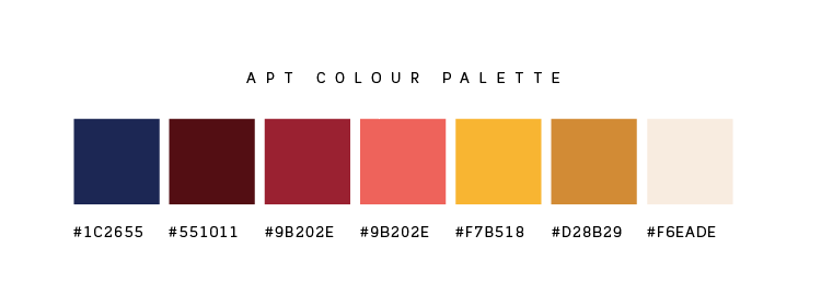
The brief from the client was to create an umbrella logo which was specifically typography based. Their target audience is 18 year olds to 65 year olds. They wanted it modern and clean and to create a friendly, warm and approachable brand – showing off the value of being people-orientated. This is achieved through rounded shapes, as well as with a warm colour palette.
The reasoning behind the logo design here is that the type is angled at 65°, which represents the state pension age. All arcs/loops (P & T) of the type are at a radial angle of 18°, which represents the lower working age group.
The two circles in the background represent the two sides of the company, APT Workplace Pensions and APT Wealth Management, working together.
The lowercase lettering drives home the subliminal messaging of being friendly and people orientated. The letters also run a little bit beyond the background circles to show that the company will go above and beyond for their clients.
I coupled the logo with uppercase lettering. It signifies security and establishment of the business.